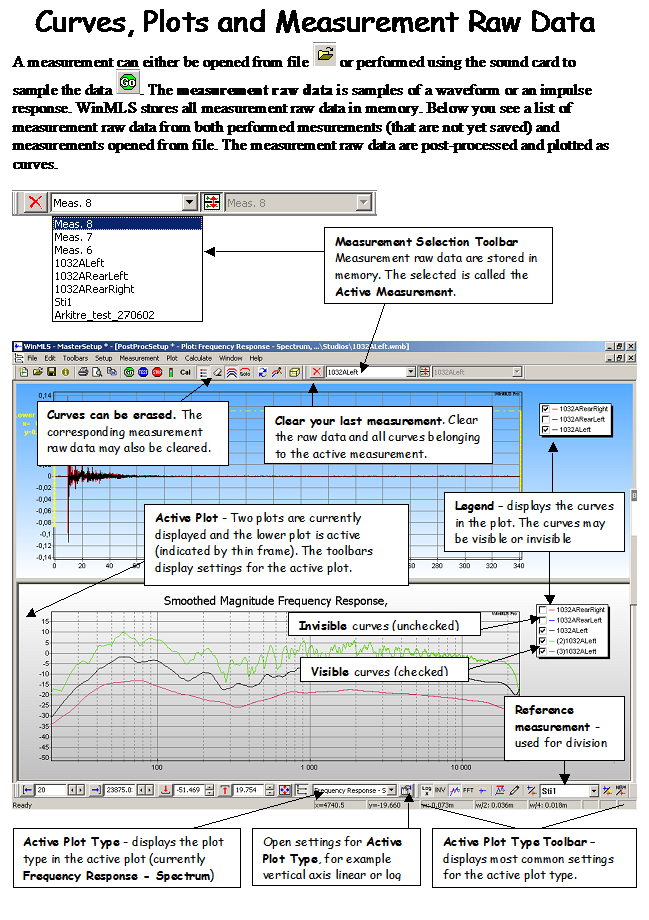
WinMLS has many plotting and post-processing possibilities. The following figures will explain how you can take advantage of and understand some of these possibilities.
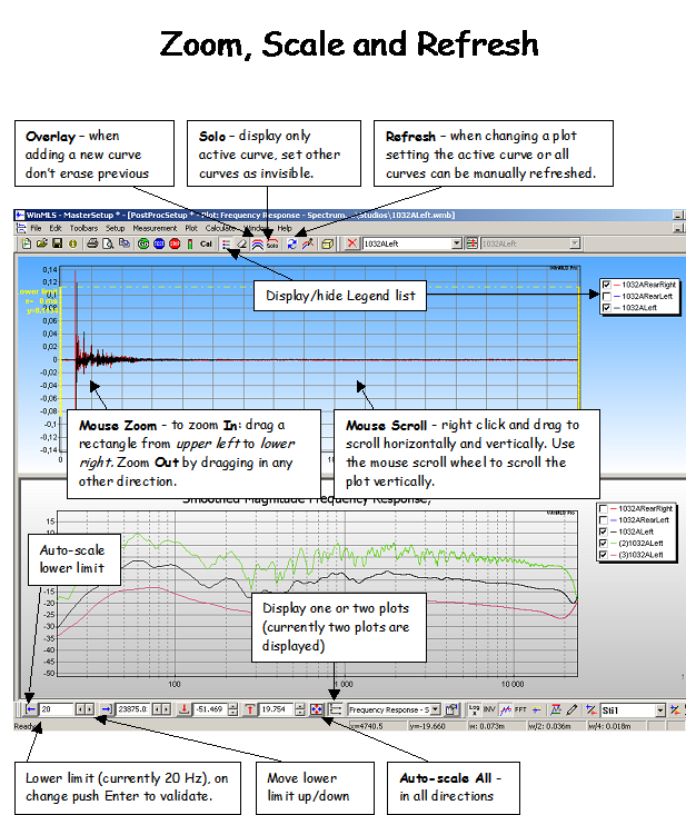
If you dont use WinMLS every day you may forget how the powerful plotting features works. We recommend that you make a copy of the two figures below and put them on the wall next to your monitor so you can have a quick look at them to refresh your memory.
In order to use WinMLS efficiently it is important to understand the user interface. WinMLS can have one or two plots displayed (in the figure above there are two plots, the upper plot displays the time data and the lower displays the Frequency Response Spectrum).
If you click anywhere in one of the plots, you will see a thin black frame around it to indicate that the plot is active. In the figure below this black thin frame is around the lower plot. The settings in the user interface will relate to the active plot, e.g. the axis limits in the lower left in the figure above.
If you click the  button found to the right of the plot type list, you will access all the
settings for the active plot. The idea is that if you are uncertain about where
a setting is found, you will find it by clicking this button. The curve color or
width can be changed permanently from Plot->Layout->Curve Styles and
Colors....
button found to the right of the plot type list, you will access all the
settings for the active plot. The idea is that if you are uncertain about where
a setting is found, you will find it by clicking this button. The curve color or
width can be changed permanently from Plot->Layout->Curve Styles and
Colors....
 Contents
 Index
Index Search
 Previous
 Next
Next