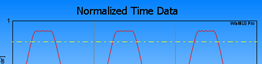
The Time Data plot displays the normalized time data signal from 10 to 13 milliseconds, you may change the scaling e.g. from the Plot Toolbar. In the figure we clearly see that the signal is clipping.
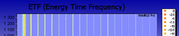
The ETF (Energy Time Frequency) plot displays the frequency as horizontal axis, time as vertical axis and level as color. From this plot you can for example check that the distortion components are constant as function of time (which they should be).
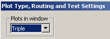
This is quite time-consuming to compute. You can choose not to display this plot this if you go to Plot->Plot Type/Routing/Test and select Triple as shown in the figure below.
 Contents
 Index
Index Search
 Previous
 Next
Next